Mehndi tutorials
Mehndi Filling Patterns: 20 Ways
The textures inside a shape decide whether a design looks finished or abandoned. Here are the 20 fills that cover almost every mehndi design, and how to arrange them.
Anyone can draw a paisley. The thing that separates a design that looks finished from one that looks abandoned is what happens inside that paisley. Mehndi filling patterns are the textures you pack into a shape once its outline is drawn: the lines, nets, dots, scales and shading that turn empty outlines into something that reads as deliberate. Learn a dozen of them and you can fill any shape a cone can draw. This guide catalogues the core fills, shows when each one earns its place, and explains how to combine them so a hand looks planned rather than crammed.
The short version
- Fills are a vocabulary, not decoration. Twenty patterns cover almost every design.
- Group them by contrast: solid, line, net, dot and shaded fills each read differently.
- Vary density, not just pattern. A dense fill next to an open one is what creates depth.
- Leave some shapes empty. Negative space is a fill too, and usually the smartest one.
Why fills decide whether a design works
Outlines set the composition; fills set the mood. A hand outlined entirely in thin vines and then filled edge to edge with the same crosshatch reads as flat and busy at once, because the eye has no contrast to grab. Change nothing about the outlines but fill alternate shapes solid, net a few others and leave a couple bare, and the same hand suddenly has rhythm. That rhythm is the whole game. Professional artists are not drawing better paisleys than you; they are choosing better fills for them.
It helps to think of every fill as sitting somewhere on a scale of visual weight. Solid black is heaviest, an open net is light, and bare skin is lightest of all. A design that keeps hopping between heavy, medium and light along its path looks intentional. A design stuck at one weight looks like a colouring page.
One outline, four weights. Bare, net, dot and solid are the four corners every other fill sits between.
The twenty fills worth knowing
Here is the working catalogue. You will not use all twenty in one design, and you should not try. Learn them the way you learn chords: individually first, then in small combinations. They fall into five families by how heavy they read.
Parallel lines
Straight fine lines packed inside a shape. The fastest fill there is and the easiest to keep even.
Jaali net
Diagonal crosshatch forming a diamond lattice. The classic Indian fill, named after carved lattice screens.
Square net
Crosshatch aligned to the shape rather than rotated. Reads more modern and architectural than jaali.
Diagonal hatch
One-way slanted lines. Lighter than a net and gives a shape a sense of direction.
Dots / stipple
Loose dots scattered inside a shape. Soft, forgiving, and perfect for filling awkward gaps.
Graduated dots
Dots dense at one edge, thinning to bare skin at the other. A cheap way to fake a gradient.
Teardrop rows
Rows of small filled teardrops. Adds a botanical, seed-pod texture that feels handmade.
Fish scales
Overlapping arcs in offset rows. Reads as scales or petals depending on scale. Very high impact.
Checkerboard
Alternating filled and empty squares. Bold, graphic and best kept to small areas.
Waves / ripples
Stacked wavy lines. Softens a stiff shape and moves the eye along it.
Chevron
Zigzag or herringbone rows. Energetic; great inside long bands and finger strips.
Spirals
Tight coils dropped into a space. One large spiral can anchor a whole palm.
Concentric outlines
The shape redrawn inside itself, smaller each time. Instant depth with zero new patterns.
Half-fill
Solid on one side of the shape, bare on the other. The signature Arabic paisley treatment.
Comma trail
Rows of tiny commas or paisleys nested inside a larger one. Builds the boteh look from within.
Petal repeat
Small petals radiating from a shared point to fill a rounded space or mandala ring.
Leaf veins
A central spine with short ribs off it. Turns any leaf or almond shape into a real leaf.
Shaded gradient
Hatching that packs tighter toward one edge for a true light-to-dark shade. The advanced fill.
Negative fill
Fill the background solid and leave the motif as bare skin. Reverses the whole read of a shape.
Bare skin
No fill at all. The most underrated pattern on the list, and the one beginners skip.
What the textures actually look like
Words only get you so far with texture. Here are eight of the workhorse fills drawn at swatch size, the way they would sit inside a shape. Copy them by eye; that is exactly how they are learned.
Eight fills at swatch size. Notice how the net and dot fills read light while checkerboard and teardrops read heavy.
The jaali net, in close-up
The net deserves its own look because it is the fill most people get wrong. A jaali is a diagonal crosshatch that forms a lattice of tiny diamonds, and it takes its name from the perforated jaali lattice screens of Indo-Islamic architecture. The trick is consistency: the lines have to stay evenly spaced and the diamonds the same size, or the net looks like a fishing accident. Draw one full set of parallel diagonals first, let your eye settle, then cross them. Do not freehand each diamond.
Same fill, same shape. The only difference is spacing. Even diamonds read as deliberate lace; wobbly ones read as a mistake.
Difficulty and where each fill belongs
Not every fill suits every space. Long thin bands want directional fills; round motifs want radial ones; big open shapes can carry a net or a gradient. Use this as a quick reference when a shape has you stuck.
| Fill | Difficulty | Visual weight | Best for |
|---|---|---|---|
| Parallel lines | Beginner | Light to medium | Fingertips, thin bands, quick fills |
| Jaali net | Intermediate | Light | Large motifs, paisley bodies, mandala rings |
| Dots / stipple | Beginner | Light | Gaps, edges, softening a hard outline |
| Teardrop rows | Beginner | Heavy | Borders, vine spines, petal centres |
| Fish scales | Intermediate | Medium to heavy | Peacock bodies, wrist cuffs, wide bands |
| Checkerboard | Beginner | Heavy | Small accents, band segments, geometric work |
| Half-fill | Beginner | Heavy on one side | Arabic paisleys, leaves, quick contrast |
| Spirals | Intermediate | Medium | Palm centres, filling round negative space |
| Shaded gradient | Advanced | Medium, graded | Large petals, statement motifs, depth |
| Bare skin | Beginner | None | Every design, to let the rest breathe |
Reading fills as a contrast ladder
The single most useful mental model is a ladder of visual weight. If you place your fills so that heavy, medium and light shapes sit next to each other rather than clumping, the design gains depth for free. Here is roughly where the common fills land.
Visual weight of each fill
How dark each fill reads from a step back. Mix across the range within one design.
Faking a gradient with a cone
Henna is one flat colour, so you cannot shade the way a pencil does. What you can do is control density. Pack a fill tight at one edge of a shape and let it open up toward the other, and the eye reads it as a genuine light-to-dark shade. Graduated dots are the easiest version; graduated hatching is the polished one. This is the fill that makes large single petals look three dimensional.
A gradient without a gradient. Density does the shading; the henna stays a single tone.
How to combine fills without a mess
Owning twenty fills is not the same as knowing how to arrange them. Three rules keep a mixed design coherent.
Alternate weight
Never put two heavy fills side by side. Sandwich a light or bare shape between them.
Repeat, then rest
Use a fill two or three times so it feels like a theme, then drop it. Random never reads as designed.
Outline everything first
Fills go in last, once the whole composition is drawn. Filling as you go leads to crowding.
That last rule is the one beginners break most. It is tempting to finish a paisley completely before moving on, but you cannot judge how heavy a fill should be until you can see its neighbours. Lay down every outline, step back, and only then decide what goes inside each shape. Our walkthrough on how to apply mehndi step by step covers the outline-first sequence in full, and the Arabic finger-strip tutorial is the best place to practise fills on small, forgiving shapes before you commit to a whole hand.
The half-fill shortcut: if a design feels flat and you only have time for one fix, half-fill your paisleys. Colour the outer curve solid and leave the inner body bare, or run a net through one half and leave the other empty. This single move, borrowed from the boteh paisley motif, adds instant contrast without adding a single new pattern to learn.
Fills for round spaces
Palms, wrist medallions and the centre of a mandala all present the same problem: a large round space that a straight-line fill fights against. Radial fills solve it. Petal repeats, spirals and concentric rings all follow the curve of the space instead of cutting across it, so the fill feels like it belongs. A common professional move is a small spiral or dot cluster at the dead centre, a ring of petals around it, then a jaali net in the outer band. Three fills, one shape, and it reads as a single planned medallion rather than three unrelated textures.
Common fill mistakes and the fix
| The mistake | Why it happens | The fix |
|---|---|---|
| Everything filled solid | Fear of empty space | Leave a third of your shapes bare or lightly dotted |
| Net lines uneven | Freehanding each diamond | Draw all one-way lines first, then cross them |
| Fills touching the outline | Rushing | Leave a hair of bare skin between fill and edge |
| Same fill everywhere | Only knowing one | Pair one detailed fill with one plain one |
| Dots all the same size | Steady but flat | Vary dot size to create a natural, graded scatter |
Once the paste is on, the fill you chose is locked in, so these are decisions to make with the cone hovering, not moving. And remember that a beautifully filled design still needs the stain to develop: no amount of fine jaali matters if the colour comes out pale. If that is your worry, read how to get a darker mehndi stain before your next application.
Practising the fills
You do not learn fills on a hand. Draw a page of empty paisleys, leaves and circles on paper and fill each one a different way. Do it again the next day. Within a week the net stops wobbling, the dots stop clumping, and your hand knows the spacing without your eye policing every line. The outlines were never the hard part. The fills are where designs are won, and they are entirely a matter of repetition. Real natural henna is forgiving of a shaky first attempt, so practise freely and let the colour mature over the days that follow.
Mehndi fills in pictures
A few real examples worth saving. Screenshots communicate far better than words, so take the ones you like to your artist.
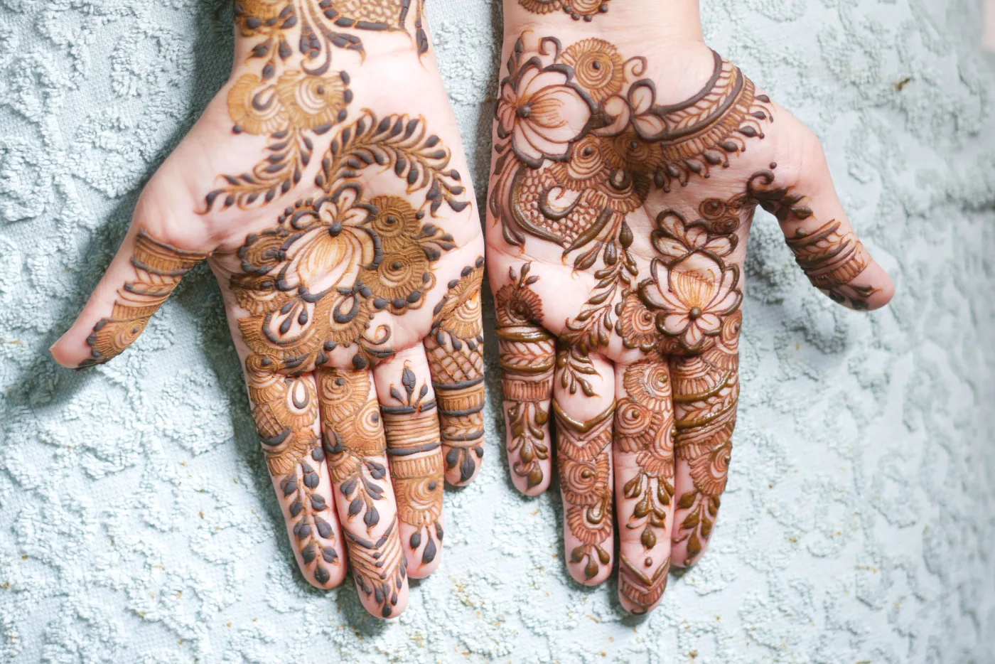
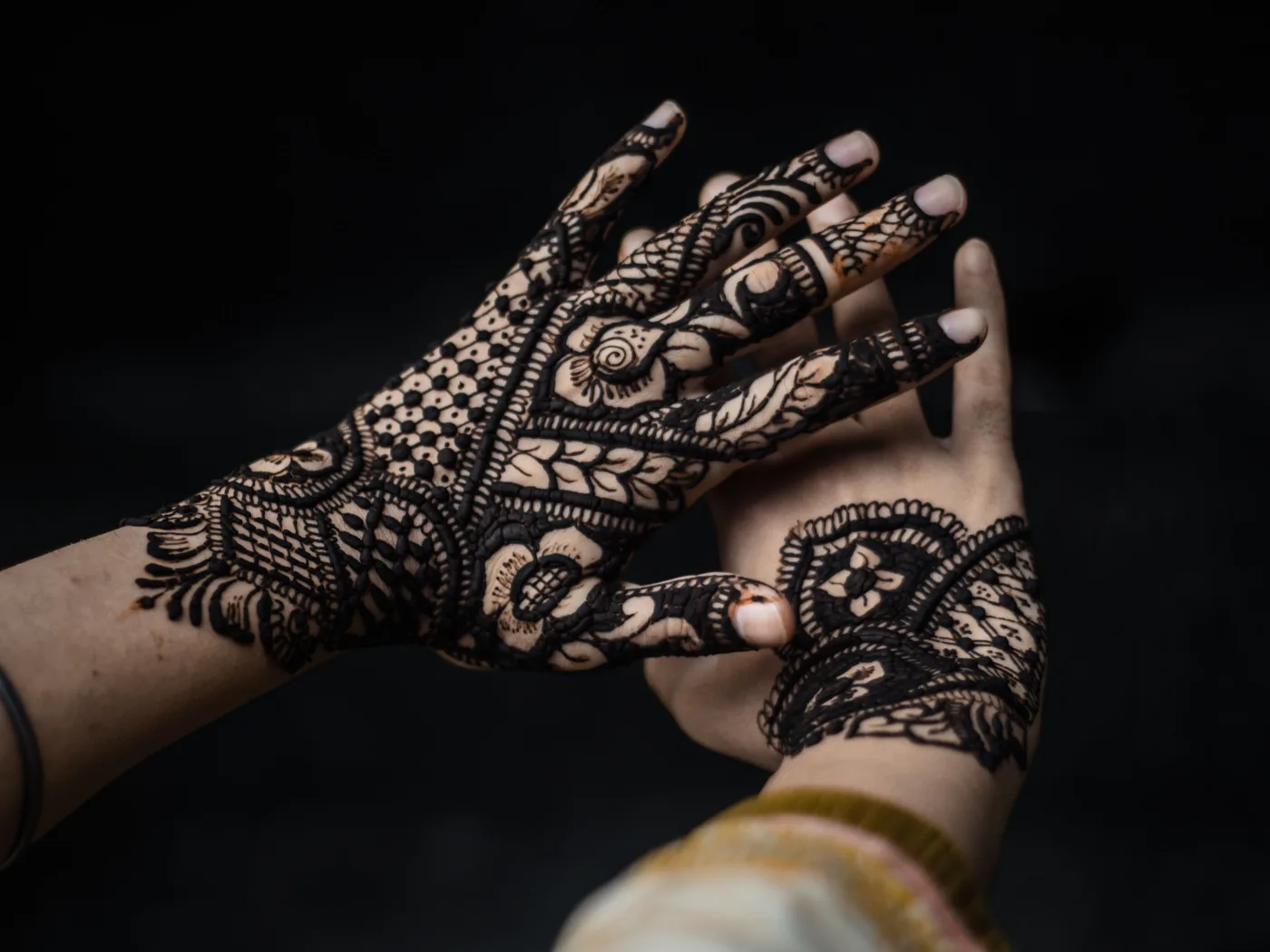
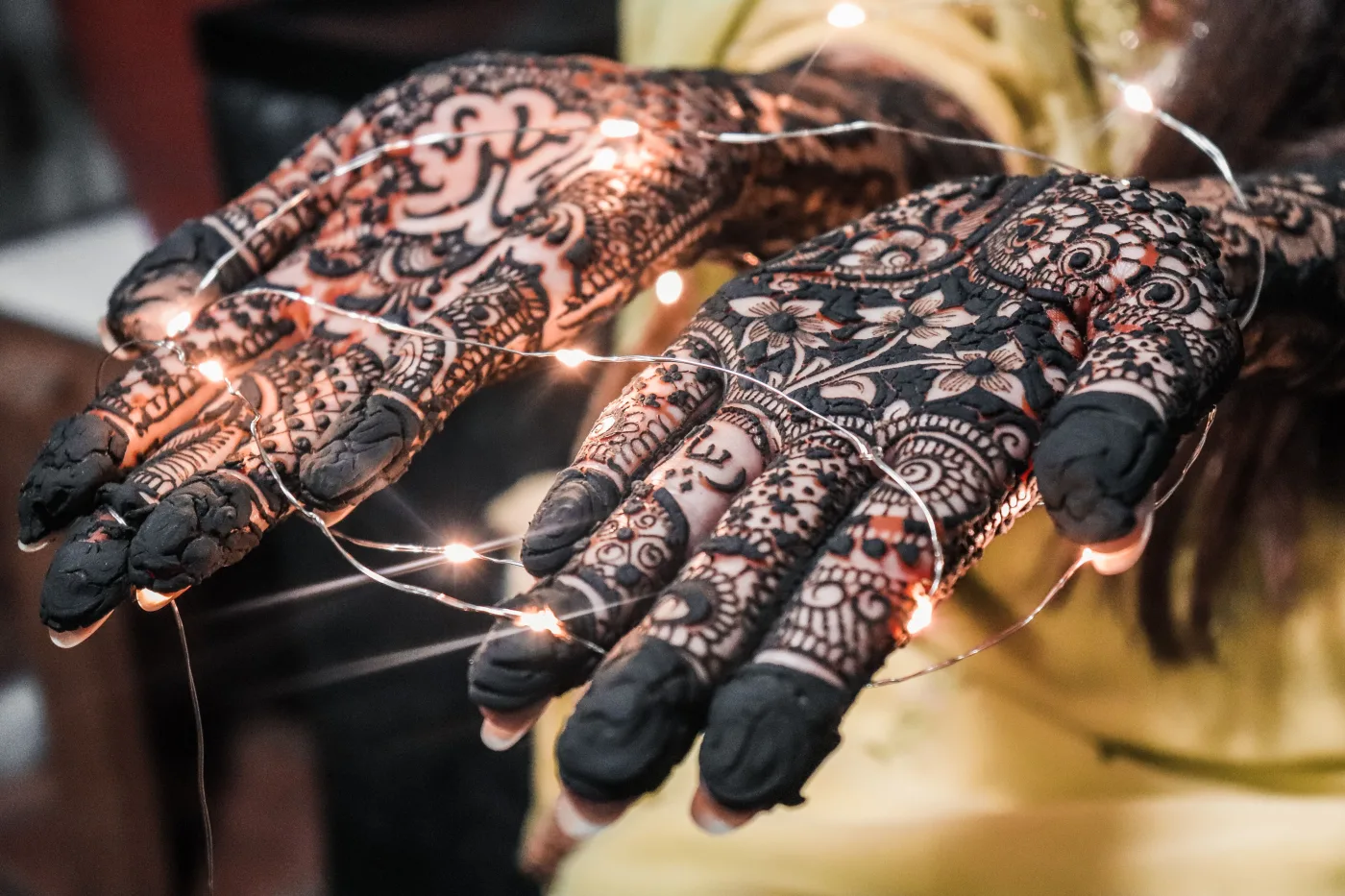

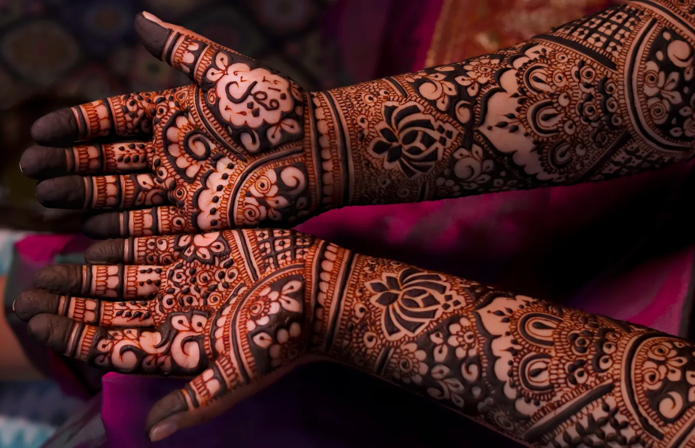
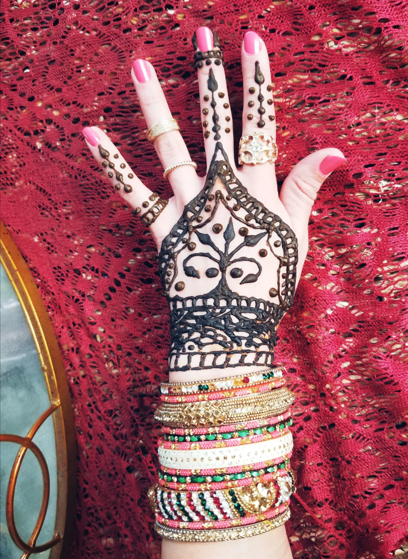

Photos provided by Pexels.
Frequently asked questions
What is a jaali net in mehndi?
A jaali is a fine diagonal crosshatch that fills a shape with a lattice of small even diamonds. It takes its name from the perforated jaali screens of Indo-Islamic architecture, and it is the signature fill of dense Indian and Pakistani work. The key to a good jaali is even spacing: draw all the lines running one way first, then cross them.
How do I fill a mehndi design without it looking messy?
Outline the entire design first, then choose fills so that heavy, light and bare shapes sit next to each other rather than clumping. Never place two solid fills side by side, repeat any given fill two or three times so it reads as a theme, and leave roughly a third of your shapes bare or lightly dotted. Crowding, not lack of detail, is what makes a design look messy.
Can you shade mehndi like a drawing?
Not with tone, because henna stains one flat colour. You fake shading with density instead: pack a fill such as dots or fine hatching tightly at one edge of a shape and let it thin out toward the other. The eye reads dense as dark and open as light, so a single-colour stain can still look graded and three dimensional.
Which fill patterns are best for beginners?
Start with parallel lines, loose dots, half-fills and checkerboard. All four are forgiving, quick, and hard to get badly wrong. Add the jaali net and fish scales once your spacing is steady. Practise each on paper inside empty paisleys and leaves before you try them on skin.
How many fill patterns should one design use?
Usually three to five. Fewer than that can look plain on a large area; more than five tends to look chaotic. A reliable formula is one detailed fill such as jaali or scales, one or two plain fills such as lines or dots, and generous bare skin between them to let the whole design breathe.
Have a question or a topic to suggest?
We read every message. Tell us what you would like to see next on the blog.
Get in touchYou may also like
Arabic Strip Mehndi: Step by Step
A step-by-step Arabic mehndi tutorial for the classic diagonal strip: plan the line, lay the vine, hang the motifs, add fills, then time the drying.
How to Apply Mehndi: Beginner Guide
Learn how to apply mehndi step by step: prep skin, hold and control the cone, draw basic shapes, then dry, seal, scrape and care for a deep reddish-brown stain.
Simple Arabic Mehndi Designs
Simple Arabic mehndi designs explained: the five motifs, the layouts worth copying, how long each takes, and how Arabic differs from Indian and Pakistani work.